Introduction
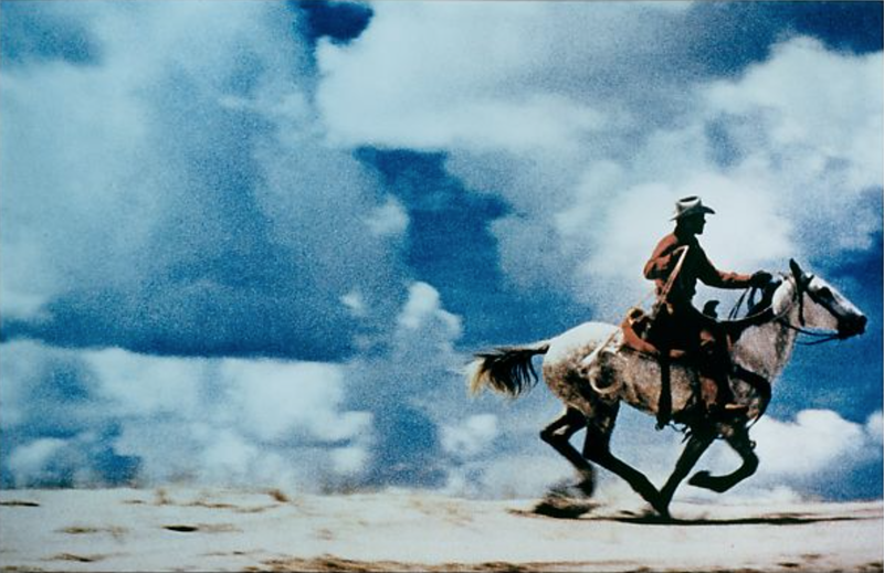
My relationship too the natural world is pretty good as when I go outside which is quite often I appreciate natural views and the Beaty they hold especially when I'm on holidays in other countries. If I could go anywhere too see a landscape I would go to somewhere with mountains that overlook places as whenever I see pictures of those online or when I have been in those situations in real life I think its very beautiful and you can see a lot of a landscape, these could involve sunsets or something else. People take pictures of nature to capture the Beaty in the moment and with landscape pictures they can be one in a life time moments so these are photographed and therefore more people can enjoy the moment. Photographs can help us change the way we see things for example in some famous pictures you can see the clear divide between rich and poor in certain countries therefore photographs can help us see political view points as well as the way we see things.


Constructed landscape images


Evaluation
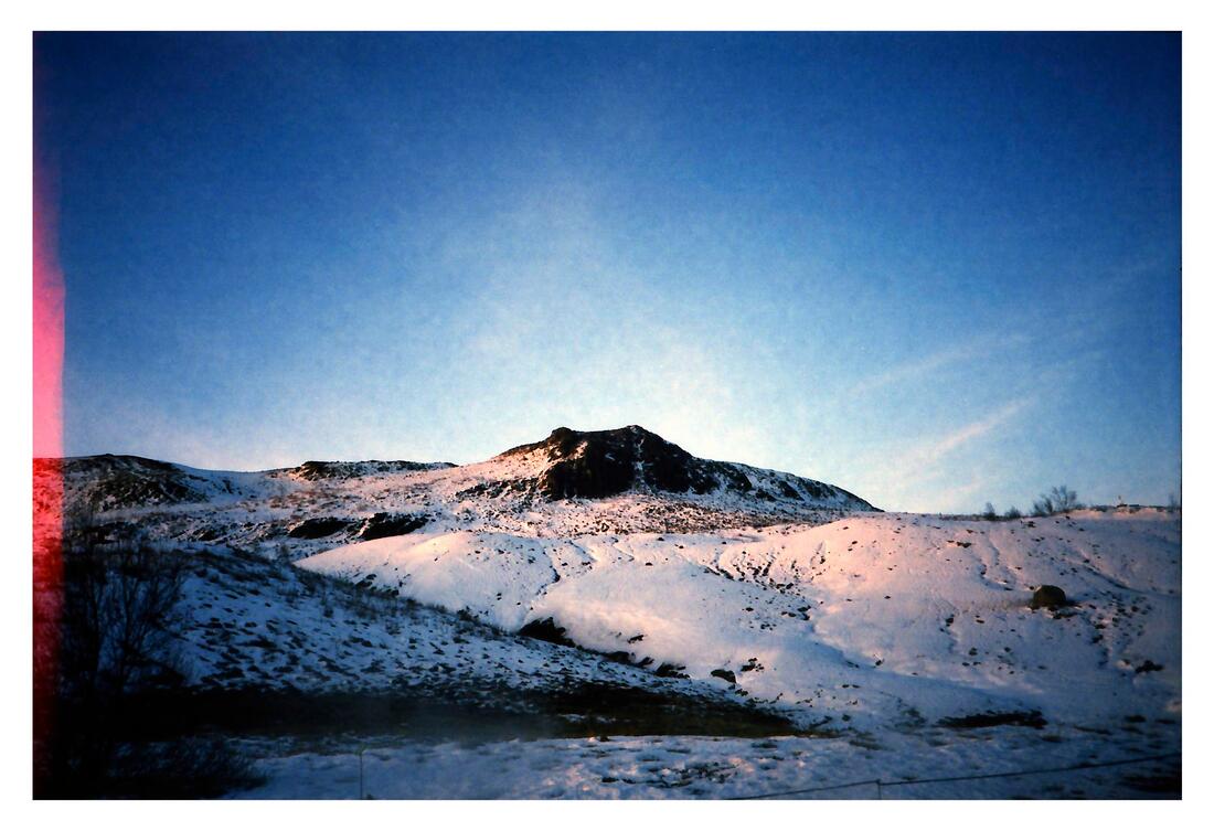
I enjoy taking landscape photographs and these are some that I've taken recently and throughout the year for example the recent ones are in Greenwich or London and although there nice my favourites are on holiday, where I've taken pictures of the mountains just like the one above and its one of my favourites because it shows the scale of the mountain as if you look closely there is a small village and it shows the size of the mountain, not only this but you can see all the details and the quality is good too. However my overall favourite is one I took in Cornwall not long ago and I was standing on a cliff overlooking the see but I managed to capture the sunset and the sky is so many different colours like orange, red and blue and it reflects on the ocean imm over looking. In general a lot of my images I like to have something in the foreground which blurs the background like flowers. In my images I like to look for a theme like colour and blaring the background but I really like when I had some sort of spooky theme with the fog and the small wooden pier as it gave it a mysterious feel to it.
What is a landscape picture?
The thing that comes to mind when I think of a landscape would be either somewhere mountainous or urban areas like cities al list of words that come to mind would be,
-mountains
-land
-cities
-urban
-rural
-size
-scale
-sky
-background
-foreground
-sunset
-sunrise
When I do a google image search of the word landscape pictures of colourful Skys and and high mountains come up also some streams, rivers and roads which lead to something else almost like a leading line which guides your eyes to the back of the image. My ideal landscape would be of mountains with a colourful sky as I think that those are the most beautiful landscapes there are and they would be very cool to photography and be in the moment. When I look out my bedroom I can see the sky and my road so on a sunset or sun rise it can be very nice and there's a picture where the camera doesn't do it justice and there was a blood red sky mixed with white and it was from my window. I have taken a landscape picture before and I do it to capture the moment because I only take photos where the landscape looks very beautiful and If I would want to re-see the image again.
The idea of a landscape
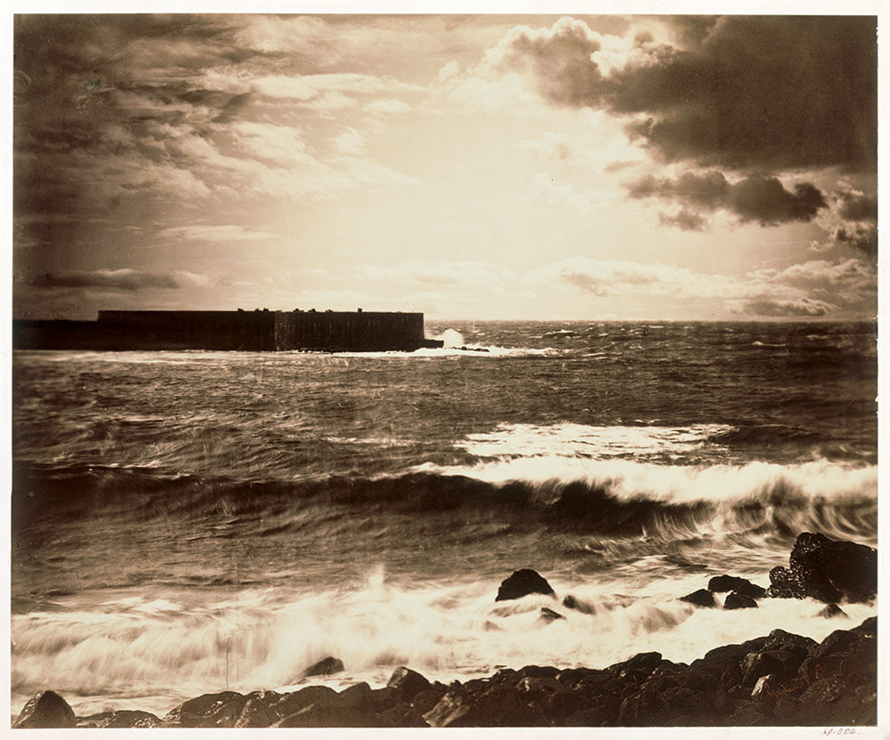
Roger Fenton - The Valley Of The Shadows Of Death - 1855
|
The purpose of a landscape picture is to be able to relive the moment whether its for the scenic feel or for example a landscape picture of a war zone which can be to relive the moment of war and be able to imagine it, another purpose could be for others to be able to see the Beaty that you have seen and to make it for other people to experience. The photographer has chosen to include all the small details like the rocks and the colour of the image gives It feel that something bad has happened their like maybe a war. The relationship the photograph to the photographer might be that he experienced what happened here and maybe was involved but escaped as the image is called the valley of death. The vantage point is high as he's taken the image from the bottom of the hill and the leading line guides us up the hill. In the image we are basically standing on the landscape but from the edge of the image it isn't too far away. The photographer has made the photograph feel empty and like something is meant to be there, not only this but even before I read the title I could feel that something bad had happened there because of the color and the dimmer. |
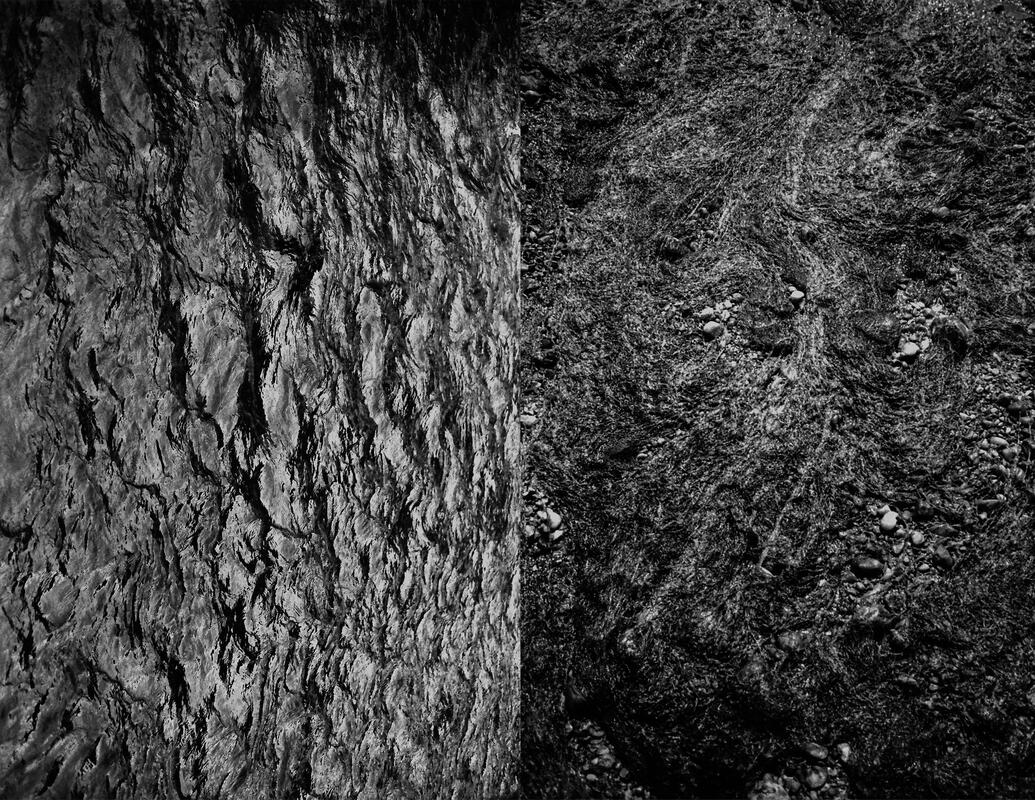
Back to the future, sea landscapes
|

|
These images describe the landscape of the sea, as you can see the one on the left is an older image but you can see all the details in the waves and clouds and it is a very beautiful image. However the one on the right is very abstract as it looks cut out and its got vibrant colors on the outer line s of the cut outs, but within them you can see the sea. The similarities i see with the two images are that they both use the sea and they both contain the elements of the clouds too. The difference between the images are that they use very different styles and they are both very unique. I would prefer to live in the landscape on the left as it looks very scenic with the waves and the bright sky, also the one the right doesn’t look very appealing to live as its very abstract and its hard to tell what is what and some of the water is murky and uninviting compared to the one on the left which in real life would be in color so it would be very nice to live there.
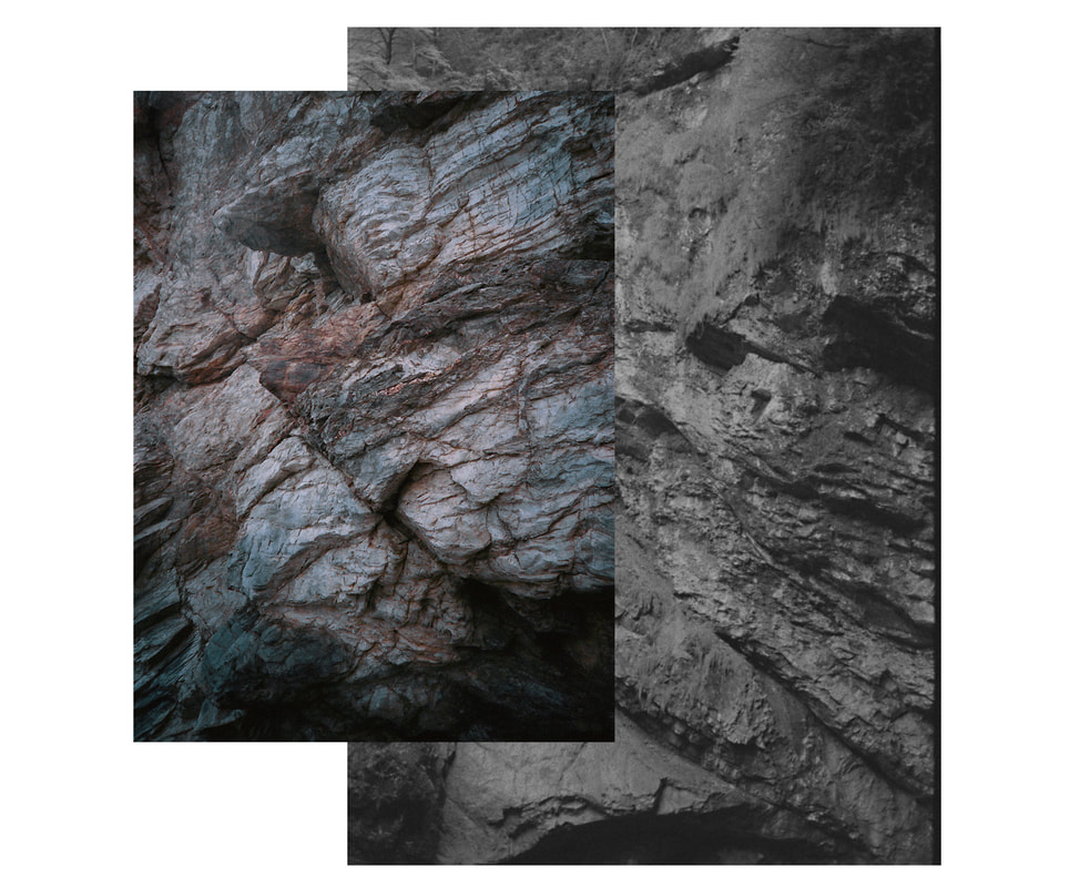
The Centre Of British Photography Trip


A big theme of the expedition is on landscape trauma and this is where the landscape has been distorted for example one of them had an image where half of the landscape was upside down making it look like a trick on the mind when it was really just edited. it also laid out the art work differently for example in the third image down there is a picture on the right and it is two pictures that's made to look like one image, I really liked that because it was a wave crashing into another image.
Overall I enjoyed the trip and it had many interesting sections and the one below was very cool as it used smaller items to create bigger images and the trip was fun and gave me new ideas.
Overall I enjoyed the trip and it had many interesting sections and the one below was very cool as it used smaller items to create bigger images and the trip was fun and gave me new ideas.
Minimalistic Landscapes: What remains


|
Liz Nielsen - Gardening with you
Liz Nielsen is an American photographer based in Brooklyn, Nielsen prefers to use traditional analog photography methods with hand made negatives and natural lighting, all of her photos are unique since she is very experimental. She even likes to change sizes with her photos and give a wide variety of colours. |
Geraldo de Barros - From the series sobras, 1996
Geraldo de Barros was an amazing Brazilian painter and photographer. He creates collages of negatives on glass plates reusing his old negatives from the 50s. He also designed many things like furniture and explored all of the arts. Also members of many groups but was the founder of The Brazilian concrete art movement. |
In lizs image I can see what looks like an outline of a bush and maybe some gardening tools however with this image your left guessing as many people may have different interpretations, In Geraldos image you can only see a tree and all the surroundings are just black space, So to compare them with missing space I would say that Lizs image is missing everything but the key outlines however Geraldos is missing everything but the tree. Something that I find unusual about about Lizs photo is that I doesn't outline the background things so we don't know what's there and only outlines the foreground things that would capture our eye in the real image, However in Geraldos image the trees have holes in them of empty space - only 6 holes of black space which are very unusual shapes but in a way it matches with the tree. When I look at both of the images they make me feel as if something is missing because I'm so used to being shown a full image however in these it only shows me a fraction of the whole image. If I was to try to create a picture like Lizs I would go on an app to make the outlines because I don't think she's stuck hers on because they look really clean and it looks like its been done online so I would do the same, with the other image I think It would be harder to approach. I think they artists have removed parts of the photo to create more of an abstract image. Geraldos is my favourite because it makes you pay attention to all the detail on the tree and all the branches and its more of a mystery to how it was created.
minimalistic landscapes


My first impression of the image is that it turned out how it shouldv'e and I'm happy with that however, I think that when I was sticking it on in the original image before the glue made it have grey patches so if I could one thing to change it that's what I would do. This photo is a photogram and with the original image I combined two images one with mountains and the sun which you can see, and another with the trees and buildings. Too reach this image I had to do two test run before hand to find out how long to expose the image with light, I started with 5 seconds and it was too light so I went up to 6 and I found that perfect so I used it for the big one.
Uta Barth


In Uta Baths images she uses a blurred focus which makes the images abstract. She likes to take images where it makes you feel isolated, for example only one of the images on the right have any people in it but most of them have nothing but rural and urban scenery. I also think experiments with the tone of the image, for example some are brighter than others but they have different atmosphere colours, like the bottom left one have more of a reddish tone and colour to it. And I will use this technique or try to in my images too as I think it does set a mood and a feeling for the image. When it comes to the urban images like the ones in the city, a key point she uses is the right lights on cars and traffic lights and this gives a pop of colour within the image. However she also likes to take images in rural areas like the woods or forest type area, and with these my favourite is the one with the sea as it creates a a contrast with the white sky and blue water so it almost looks like the image is split into two because its blurry you don't really know if its water or something different.
Experimentation


These were images inspired by Uta Barths and with my ones I struggled to really capture her images because there wasn't a city type place in school. However I did capture a bush and tree type scene and I tried to make sure there was no people to try and get the isolated feeling but again I think it will be easier outside of school. My favourite image is the one with the two trees that has a toning to it, its got a warmer feeling to it. There was a limit as the environment I'm in doesn't have the opportunity's so when I do it outside of school I think I can create some really good images but these were very good experiments and I learned a lot. I surprisingly like the images with the leaves on the floors it provides pops of colour all around the screen and it really reflects the seasonal change into autumn.
Out of focus experimentation


With these images I was inspired by the photographer above Uta Barth with her images she takes them out of focus, she focuses usually takes landscape images of greenery like forest or an urbanised area like maybe a city road. Working with out of focus images made me try to capture different things and things that would stand out, However I also interpreted her images as trying to capture isolation and my favourite image out of these does and that's the one with the bike racks and the vines are overgrown and I like that the most because the overgrown vines show how its been left alone a long time. I also like the ones on the train and they shown the urbanised way of her photos in a different way and they have water droplets on the window so it creates a different look to the image. A way I could improve my images is trying to capture the greenery images that Uta takes and I think in some of my images I steered away from Uta's style, so if I was to do it again I would make sure to maybe have a reference photo with me so i can stay on course with the type of image I am taking.
Dana Talmor
|
Dafna Talmor often feels conscious about being overwhelmed as the amount of possibilities she has with her photos and surrounding are endless, Dafna enjoys the idea of a utopia image or world and therefore reconstructs her images to broaden that idea and try to capture it. In a way she explains how she wants to unify beautiful spaces into something greater. She likes the contradictions between her reconstructions. She reconstructs them by using scissors and spatulas to get the perfect cut that she wants too - she has many different landscapes all in one and the idea of disorientation whilst looking at the image, she wants to make the active seen my aware and to make the watcher really look into her photo in depth to capture that. I personally really like her perspective of images and I think it will widen everyone's perspective of an image and the construction. It also made me think that breaking down an image and building back up is a great technique and makes the person looking at it really think and that's what I like about it. Its also given me new thoughts on how to construct my own images.
|
|
Danfna Talmor slide images


In these slide images you can see the comparison between the slides and the projected images, these are inspired by Danfna Talmor as they have been constructed in different ways for example cutting them out and rearranging them, taping patterns and colours and scratches. My favourite one being the one on the left, I constructed them different by cutting the image out into quarters and put them in a different arrangement which made them abstract and meant you have to really look into the image, also the tape makes defined lines which I like. Although it could use some refinement and its the wrong way round. So overall I would like to repeat this process but refine it. I also like the scratching in the mountain as it outlines the whole mountain and shows the little details.
Experimental


Dionne Lee
|
Drafts from Dionne Lee on Vimeo. |
In Dionne Lees video she uses a plethora of landscapes to create new and interesting landscapes. I say they are interesting because I like how she uses more than one landscape at at a time and isn't afraid to rip them and section. The video also gives a relaxing feeling because of the piece and quiet and the Beaty of what she is creating. It can also be confusing because your left unsure with what she is doing throughout the video as she is also creating very abstract landscapes which I like a lot. She also wasn't afraid to use very different types of landscapes like space, sea and the earth. This film is a constructed landscape because she is slowly building up and constructing different landscapes together. It is very different to conventional landscape image's because its a very abstract idea that is something I've never seen before and she uses ordinary landscape and messes it all up in a way.
|
Dionne Lee inspired still images
|
|
In these still images I cut out pictures and put them together in different orders. I like this way of photography as it makes my images more abstract and can addd different effects to the image. I like how I zoomed into images for example the lime bike, in the whole image of the zoomed out version its just lying there. I definitely want to do more images like this with different pictures and maybe even take it to another level with using more than 2 or 3 images and with different types of landscapes and elements like the sea and sky and ground.
|


Dionne Lee film
|
|
In my interpretation of her work I tried to capture what she does by making this video. Overall I like my video and I think I did a good job however I could improve by adding things like music and different editing skills. I also could've used a variety of landscapes and I feel I was restricted because I couldn't use other photos. I like how I used other picture to zoom in for example the first two images in the film. I also tried to incorporate a story type theme as if you look closely you can see I went on a walk and took a few images which makes it look better. The landscapes all followed a similar theme which was green landscapes with trees and bushes.
|
Final project - Aster Reem David - salt and light
|
|
|
|
|
|
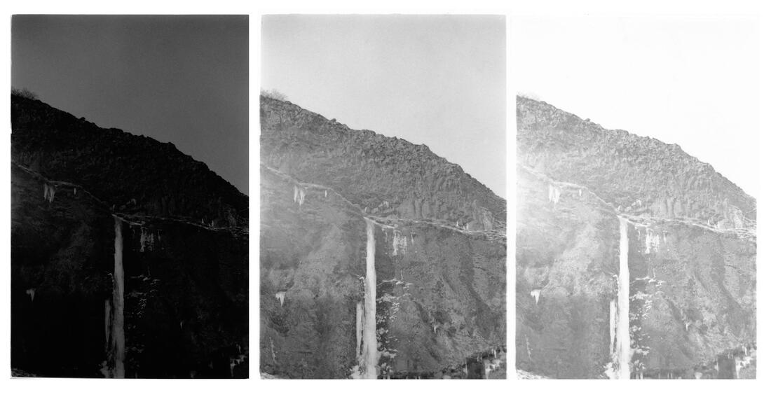
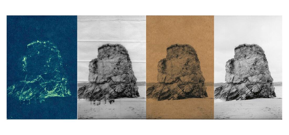
Aster Reem David takes very beautiful photos but what I like the most is the way he constructs his photos and the variety of different constructed images. He does this by using different techniques for example changing font colours to black and white or maybe tinting them different colours to red, I think he tinted this particular photo red to link his idea of deteriorating landscapes and things like global warming which the red tint could represent. He also takes to different images and try to make them look like there in then same image which I really like and want to recreate myself. I like how he focuses on one things in the image and one key point in the landscape which shows the individualism that landscapes have which often isn't shown because landscapes often have a lot of things going on. The camera portion is also elevated in most of the images giving a neutral viewpoint instead of the landscapes tower overing him when it comes to the mountains. The detail that's shown in the photos always stays the same and you can see everything like all the cracks and different colours. When reconstructing his images he also changes the paper look for example he creases the paper to give it a different look or edits it and even it looks like he's inverted some of the colours. To recreate these images I'm going to have to take particular images of landscapes which fit what he does and I'm going to edit them in different ways and alter them on paper to create a more abstract image: I may also do more than one of his genre because I like everything he's done and they do vary a lot but they all have similar background images which make the image whole.
Single image evaluation - Aster Reem David - salt and light
In this image form Aster I really like how he took one image and changed it multiple times and put them all together. In the orange toned one I like the texture that he gained by doing that which I want to recreate. I think what Aster captures in his images that is quite special is the texture which he does a plethora or times throughout more images but mail these, he also does it in the next one along where it looks creased in places and even has some sort of ink or paint dripping from the final crease. Aster also doesn't over complex his original image as its only a detailed rock but although its simple its effective because those small details create shadows when portrayed in black and white, there also isn't much in the background making the edits more effective. The editing he does I also like because its like he's inverted all the colours and put his own spin on it. The layout is good because you can compare all the images together and see the differences between them. He takes these image in portraits even though they are of a landscape and he does this so he can compose them all together. In my opinion in some way they kind of represent different time periods as the orange tint one looks old as that's what really old phots look like and then the normal one is quite modern and then the inverted one looks futuristic. All of his work start of in black and white and he then constructs them in all different ways and he does this by using editing and processes with the paper itself.
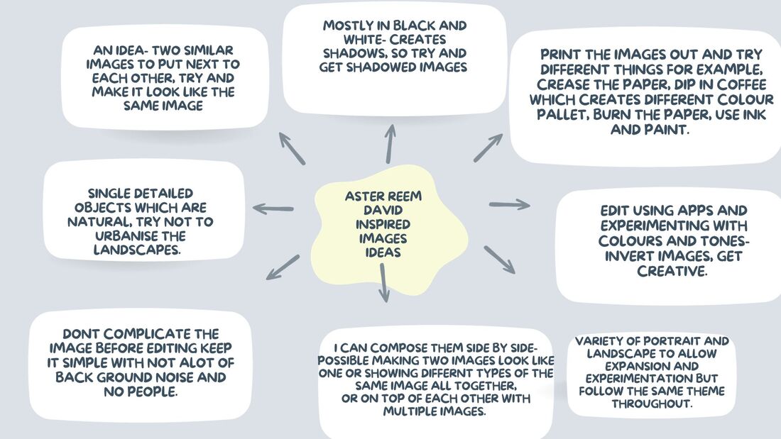
Mind map - Aster Reem David inspired images ideas
Aster Reem David inspired experiments


I took these pictures in a variety of places because I think these ones would look the best in his style with editing and the landscapes are of mountains and some snow which is what he does. I kept them all natural with some being up close which is what he does in some of his images. Some were even originally put in black and white so I don't have to edit them. My favourite is the one of the water fall because I feel like it has a lot of editing potential but it is similar to one of his so I can experiment around that idea and broaden it even further in my own style. The photos that I chose I think have a lot of chance to change and experiment with them and create a plethora of different images with just one of them. The landscapes that I chose are similar to his because I really like his original images and there simplicity but still have depth and something to the image. However when It comes to the closer images there are always lots of detail in a compact way which I've captured with the shells and stones and in these the images are full but have detail and I will most likely change them to black and white when I start doing my experimentation.
Editing process


In my editing process I've used photoshop to change and make the images the way I wanted, I wanted them to be black and white, and different colours. I also wanted to make them side by side like Aster and overlapping by changing the opacity and the percentage of the opacity which makes it more see through the less percentage you make it. In mine I made it around 40 percentage so it wants to bold over the background image but making it so you can still see the image overlapping clearly. With the brightly coloured images I did that by using filters because I wanted it to change the mood and vibrancy which was very successful. To go above this I want to experiment with changing colours and the way the photo is presented by doing it in real life and then scanning it in.
Experimentation - photoshop


|


|

|

|
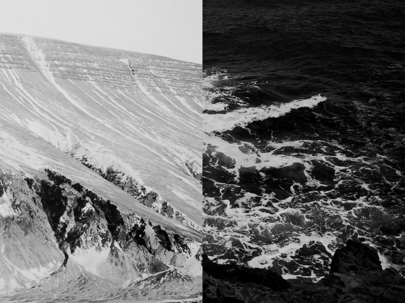
With these images I experimented with colour and overlapping images to create different effects and abstract images, I also made collages with each image in it being the same but being different colours and different tones to the image. My favourite one is the black and white one with the mountain and sea, this ones my favourite because they link together in a way making it seem almost like the same image but they are actually different images, the patterns in the water in black and white look similar too the ones on the mountains which is why they link. The one just above is also the same images but I wanted to experiment with colour just like Aster but next time I will invert it instead of changing the colour to make it even more abstract. I also like the one of the overlapping waterfall because the background image is black and white and I made it merge with the coloured version in the top left corner of the image which gives it a different effect. These are inspired by Aster because he uses black and white often, he also does collages and columns where each image is different, in colour and the twist in mood showing a differentiation of the image. He also does overlapping of images but I changed it it and changed the opacity to make them see through. With my next experimentation I want to create these collages with the photos actually printed out, I can do this by printing the pictures out and changing them the way I want to making sure to make them all different and obscure. Im then going to scan them in as a collage or make it a collage on photoshop.
Editing process


In my editing process I struggled to think of the way I wanted to presented my work as there was many different ways to show the obstruction of the landscapes, I wanted to creased the paper which is what I ended up doing with the landscape picture of the waterfall. I did this because the contrast of the vivid green and orange looking mountain looked very good together but also created confusion and obstruction because the trees are there and obviously there are not normally lots of trees on a snowy mountain. I did this by folding the paper which created a grid looking motion on the paper. I cut out an image from a similar picture to the background one, however its in black and white and I made it that way by printing it out in black and white. After I cut the pieces out I wanted to see which way would look the best so I laid them out the best way I thought was right. I then tried out layering with coloured and non coloured pieces of the mountain because I thought it would add to the image.
Experimentation - altering landscapes on paper

In this image there is a total of three images all in one, this is inspired by Aster because I added texture to the image of the waterfall and used layering with the mountain using black and white and also the waterfall image. I wanted each piece that I altered to have an impact. One of Asters images he has a piece almost hanging of the paper which is what I incorporated by also using texture to show the altering of the landscapes. The layering of the mountain is my favourite part as it turns from black and white back to the original colour whilst also changing the type of mountain as you can see in the centre there is a more ruff and edgy mountain sides compared to the black and white behind it and the original background image behind it. I also like the contrast behind the green trees and mountain, the different colours and colour change I think makes it a lot better but also the actual image change from mountain to trees I like because it change terrain and elements into the water of the waterfall afterwards. If I could change things now after I finished it, I would make it so the picture of the water fall was at the bottom of the page so it looked like the waterfall was actually falling of the image because I think that would make a cool effect. I would also rearrange the black and White Sea in the sky as I think I could make it have more importance.
Experiments to use


In these images over the week I went to a few different places such as Greenwich park and the heath. I took these pictures mostly in the morning so therefore there is a golden shade or a misty look to a lot of the images. Aster does natural landscapes so I made sure to take natural landscapes by making sure there isn't much urban work into it for example no building and people and man made objects, however he also does close ups of land which I made sure to do. With these images I can continue my experiments with Asters work and extend on what I have already done, this will allow my experimentation to further improve and make them bigger scale. For example I can do a bigger collage with this work as they have a similar feel to them too, I can also make a book with some of these images as well as the previous ones. My favourite on is the one at the top where the image looks like It has a darker orange undertone, the image already had this and even though it looks like it may have a filter it actually doesn't which makes me like it even more its also misty which creates mystery and a feel to it which I like a lot. The image also is completely rural and the autumn season that we are in makes the leaves orange and brown which adds to the whole effect. It relates to Aster as it is a landscape but I can make it relate to him more as I experiment further with the image and I can combine it with other images that I have taken and change the look with filters and obstruction making it more abstract.
Editing process


In my editing process I went through a process of trying to make a structure, I did this by printing out the selected images and I chose them closely however I did come up with something and that was the images came out very pixelated to if I was to do it again I would print out less but more images. I then got the cardboard material and cut the images to fit it the way I wanted it to which was in a square shape and a longer shape to differentiate the sizes to make it more abstract and different. However I decided to change it and do something similar but in a different way. I did the same process but used the spray glue instead of a regular glue stick, this allowed the glue to not create bumps and crease making the structure better. I cut slits into the cardboard to allow the other pieces to go through and create the structure. This process took a while and it was definitely my longest one as it took some trial and error and cutting thick pieces and sticking which I had to leave the classroom to do, also making the structure into the way that I wanted it took some decision making.
Experimentation - structure

|

|
In this experiment I explored making a structure with altered images which I have created before suing photoshop. I used these images because they were Aster inspired and I wanted to keep on that track and not steer off, however I have twisted it in my own creative way as I made that structure. They are Aster inspired because they are landscapes which have been altered in his style by overlapping images and being experimental with colours. Although this was an experiment I was happy how it came out, however there is a lot to improve and this is something that I will be repeating next week. For example I want to add more images with colour to make the whole structure stand out more, I can do this by remaking some images on photoshop but make them with more colours and brighter colours. I also wasn't very happy with the quality of the images which you might not be able to tell on the photo but in real life it was very pixilated, to counter this I will make a small structure with smaller images but to compensate for the lack of size if will make the structure bigger by using a wider range of images. I also want to make the images double sided as then jo matter where you look on the image it is full of landscapes as in my one now it was basically bland on the other side which I didn't like. Im going to counter this by printing out the images double sided, this means I need more images. But overall it was a good experiment and I learned a lot to do and I now know hat I am doing next week.
Editing process


In my editing process I went through the same process as I did in the one before, I did this by printing out the images with a couple of them being different. I then cut out these printed images with the cutter, then getting spray glue to unsure that there would be no creases and it will look as good as it can. After I have laid out the images and stuck them on I would then cut them out precisely to make sure they would fit them nicely to endure that the structure has good base layers. I also made sure to stick an image on each side as that is what I said to do to make the structure look good from each angle. In this process I also had to cut off the white paper lining the images this makes the images look more clean cut and overall improve the quality of the image. One thing that went wrong in the process is that even though I tried to print out the images smaller so the quality would improve, however they still printed out with poor quality so therefore I might now choose not to do this experiment as my final project but I am happy that I tried it a lot as they could've came out much better but there is not much more I could do. Also in my editing process I had to to use a cutter as I needed very precise cuts. I also had to experiment the structure in different backgrounds as that was also a part to improve on from my last one.
Experimentation - structure redo

Overall even though some things didn't work the way I wanted it to I think I have improved it a lot since the last experiment as there are more dimensions to it because I made it double sided so all the sides had something too it or something different on each side and more to it than the previous one. I still created a structure with altered images that I produced on photoshop earlier on which link to Aster as the experiment which they were made was inspired by him and some of his photography. I think the smaller images worked better but if I was to do this gain I would definitely try to sort out the quality of the images and make it much bigger to make it a proper structure. However I liked the end result as I could see the improvements I made and I enjoy the process of making the structure. Also the colour gives it a pop and even though that particular image is very abstract it gives it another thing to it and I put it on top on purpose as I wanted it to stand out other than a black and white image which may not of done the same effect. The images all worked together as they are all landscapes which have been altered and changed, this again links to Aster as that's his style. The background I choose was a plane white one as it allowed the colour to come through especially the pink and green image to come through more, it also makes the overall image and structure look more clean and not displaced anywhere.
Edting process


In this editing process I went onto photoshop to create not only more diptips but experimenting with combining images as two which creates a distorted image and a constructed landscape. To do this on photoshop similar to what I did before I changed the opacity on the overlaying image on top and changed things things like vibrancy to make it stand out more and make it seep through the image more. Furthermore to create the collages I had to make the first image have white extensions one the side to place the other images on it after I don't that I had to select each image and change the colour and change what I wanted to. With the one below this I wanted all the images to be black and white so at the end I did an overall change. However this differs when the one with the same images next to each other because I had to change the colour ever so slightly to make the images different but still the same image. To make these adjustments in the photoshop app I had to go the bar at the top and go to image then adjustments and that's where I change the dimensions, colours and tone of the image as well as combining the images. To create the little images I had to shrink them and place them carefully where I wanted them to be next to the bigger image, I also wanted them to overlap so I made sure to place them over the little images as well but only partly. I also drew a drawing of a plan so i could have a greater understanding of what to do.
Collages/photoshop - experimentation


|

|
These images I tried to make them like Asters images as I think he pairs his images very well and I wanted to see if I could do similar to him, I did this experiment today as I wanted more images to use for next week as I might develop these even further and create a book. My favourite one is the one on top of the two above as the images that I selected all pair really well in black and white as they have similar elements like snow and water which create a clean look but then I made that look contrast with the ruff and jagged image of the water fall and trees which isn't as calm as the other Images. I also think its appealing to look at as all the images are hoping up and overlapping each other meaning there is no spare white space between any of them which I like a lot. The reason I like the coloured one to the right is because I combined images with the same elements like trees and grass and I really like the way It turned out as it still follows the constructed landscapes idea as it is abstract. As Aster likes making collages and placing images next too each other that's what I did but in my own way. The waterfalls next to each other three times follow the same idea as an image that Aster did however I kept one of mine the normal colour as I didn't want all of them to be the same colour but only slightly darker, instead I did that but with colour and only one black and white image. Furthermore after this I am going to create a book with these images and the ones that I have already made. I also my make more of these collages and make a collage book.
