GCSE exam questions


Why I chose fragmentation
I chose fragmentation because I think its suits me well as I can think of many different things to do and experiment with, they also experiment with urban areas which I enjoy doing and for example Marilyn Henrions work interests me a lot as it has often has bright colours which I want to experiment with this component, but I could also do a contrasting piece by using images on nature but In a similar fashion. Also with fragmentation you can work with people for example David Seidners work as he uses many different techniques to alter people that also interests me. The theme fragmentation means I can use things to alter the images and add to them like reflections, I can also use photoshop with my work as everything is presented digitally and using photoshop made my last component come together I want to use it in this one as I want to nail the fragmentation theme. I also think that photoshop is one of my strengths in my last components and allowed me to abstract images. I also like combining other images to make one whole one and I think this is the best one to use that ability, this also means I can take a plethora of images when I do take them to make sure I can combine more and more images in my image. Fragmentation also leaves a lot to explore for example and means It won't restrict me in ways
Fragmentation mind map

Marilyn Henrion - research


Marilyn Henrion takes images of buildings and urban areas and combines the images in different ways. I like the way she uses color as they sometimes clash and contrast but still look good together. the patterns and ways she presents the work is different most times and she either splits the original images making two in one image or she may use multiple images and section them in rows. The images that she uses are all very similar but have different motives like color but some of them do connect and some of them don't but they all match and fit, this creates very interesting images which pull you in. She also experiments with visual textures even making different sections a different texture absorbing it with abstract themes and just making it better. When I do images I want to experiment with lots of colour and many different images in one which I haven't done before and not only is that out of my comfort zone and that's what I want to get comfortable with. In my work i would like to use some of her ideas as I think I would be able to do so and i think it would complement my style as i like to edit which she does and like i said before i want to start to use lots of different colors. By doing this style it would also push me to take more photos before hand as she uses lots of images to make one. What really interests my about her work is that all of these images that she uses looks like whole whole image not just a bunch of images bundled into one.
Single image evaluation

This image is my favorite as it involves everything I want to for example lots of color but also different colors between the image. In this image she has taken lots and lots of photos to create one single image, she does this very precisely as they have to match or work together in some way. These images are of buildings with lots of variation of different types of buildings but they still work well together. The image has carefully been put together which keeps some empty space at the bottom and top which looks good, this also makes each slice of image look more abstract and makes you question the image. the image has also been split into half with one side being black and white which I think is very creative idea however it does have one anomaly which ruins the pattern which presents the image as abstract and uncertain. The black and white then contrasts with the top layer which has lots of vibrant colors that pop out nicely. She also daily focuses on brick buildings as the texture looks good and shows more of an older generation which compares to the glass buildings showing the younger and newer version. The buildings themselves also have loots of layers which shows the image in depth almost like a building itself.
Homework - experiments Marilyn Henrion


In these images I wanted to take them so in my lesson I can further experiment with them for example the images below. Only a few of them represent fragmentation for example the tree which has been splintered into multiple which creates a fragmentation effect. However all the rest I saw I could use for experiments because they had singular objects so if I combined them it would create one image with multiple things in the image. Also I made sure to take some images look similar so I could combine them to make the image look like the original building which I actually did in the images below. The textures of the brick also interested me as they do not only vary in colors as some are mossy but I like all the individual bricks. Next time I would try to make more images so I could use more in my next experiments. Also next time I want to go somewhere urban with brick buildings so I could do that by going into town with also using much more color in the images especially brighter colors like pink and green which contrast but go well together creating more of an interesting piece.
Photoshop fragmentation experimentation


For these images I have selected some images from my homework and I have edited them on photoshop. To do this I had to crop the images and place them each at different times on too photoshop to create an abstract and variation of the original image. This all links to my theme fragmentation because it is fragments of an image put together to create one. My favorite one is the one with a mix of black and white and the bricks and wooden door as I think it looks the best overall. I think it looks the best as it still resembles the original image but in a different style. I also like the full black and white one as it has the same effect as the one before. However the other two I don't really like as I didn't plan it very well at all and they are just images bundled together I did though think it was good to experiments as I now know what to do next. Next time I know that I have to take more images before hand so that I have more to work with. Also for next time I want to experiment with color and building so ill make sure to take images with those components so I can edit them into what I would like which would be Marilyn Henrion's inspired. This work is also self taught on photoshop.
Editing process


In this editing process I used photoshop, I had to crop and distort the images each in different. I did this by adding color schemes to the images in streaks which make fragments of color in the image, I did this by going on properties and changing the color to one that I thought was abstract yet didn't completely feel strange in the image. However for the others not evolving colors I had to layer the image multiple times with the same original images which was a long process, although they came out nicely as I could make it so some sections where black and white and some in its original color. I also used the edit function on photos and this is because I had to change the dimensions of the images before putting them into photoshop, this made it so I could change the directions of the images to make them look fragmentation.
Homework - experiments Marilyn Henrion


In this homework my goal was to refine my ideas that I had last time. For example I wanted to find brick buildings/ housing which I did in my local area. The way I am going to use these images are that I am again going to experiment with photoshop like I did last time however this time will be more similar to the person who I am being inspired by which is Marilyn Henrion. She mainly uses buildings and makes them all look like one which is what I'm planning to do with these images. with these I could also just use the same image but change the colors to alter the images. Combining these images will also look better than my last experiment this is because most of the buildings are fairly similar with only different dimensions which I can use to my advantage. I prefer these image to my last as I feel as if I can do more with them and stay closer to my theme and inspiration. For my experiments I can take fragmentations from each of them and distort them with color and other things that make sense and then put them all together to create one image which looks like one image but its made up of lots of different ones. I enjoyed taking these ones more as I had more of an idea in my head of what I wanted so they didn't feel so random and actually seemed though had more thought behind it.
photoshop fragmentation expermentation


In these images I used images form my homework as I like I said in the last evaluation I wanted use brick which is what I did here. My favorite ones are the last ones because that's what I wanted to achieve and I think they look the best. I think it looks the best because I used less images to create it and the color scheme that I used worked well but I was trying too be more experimental with colors which was one of my goals from my last project. I also like the abstract and contrasting colors for example red and blue next to each other which are usually seen as opposed colors but they go well. These were again inspired by Marilyn Henrion ask tried to make the image so it all looks like one image but with different colors and components of different images all In one. I only used two images for this and they complimented each other well. To make this I went onto photoshop and edited the images and color but before this I had to go onto photos and crop each image before putting it onto the photoshop which can take a long time because sometimes I have to change the angle as they can be a little off or make it tilted to the way I want it. In the ones above the spacing were done on purpose to create an effect of missing and it all has to do with fragmentation and they are lots of fragments with all the windows but also the image as a whole is made up off fragments of other images. Next time I'm going to make the images with more images and it may take longer but I think the result will be better.
Editing process


For these image I had to follow a similar process to the last experimentation. I used photoshop and edit function in photos as in photos I had to crop them in different shapes and sizes for example making the slimmer to try and follow the same theme as who I am inspired by for these pictures, I made them slimmer by cropping them and once they were all cropped I could pit them onto photoshop all together to create a collage. This same process is the same for the images that are only distorted by being in a collage with all different shapes and sizes, however it was hard to measure and fit each image with no gaps in between. When the image where set up I could click on them individually and edit them in any way, I changed there colors and tones which on some of the images I made it symmetrical on each side. This all follows fragmentation as in the editing process I took fragments of each photos and combined them to make one complete image, Also made sure to keep in all the windows during this process because it gives a feel of fragments as there glass and there's lots of them.
Book fragmentation experimentation


In this book it has my edited photos which I did in my previous experiments however I could alter them on the printer which meant I could drastically change the color and also do multiple layers. This created an interesting book as not only are the original images quite different as they are already edited but I wanted to do very bright colors so each page in the book would stand out. This relates to fragmentation as the original image has fragments of multiple images all to create one image. Also I tried not to use the same color more than once or the same shade of color this not only makes each page unique and makes the book not boring. But it's like fragments of the color wheel each having its own image. My favorite ones were the ones which are extremely bright colors like the yellow and red this is because they really stand out and make themselves known. However I also really like the double layered colors as they contrast each other for example green and pink don't usually go together but I did that on purpose. If I was to do this again I would use more original images as some of them are the same this would make it broader and look better. This would also mean I could create a bigger book as I wouldn't be repeating myself. I could do this by simply taking more photos a and editing them.
Laura Letinsky - research


Laura Letinsky is my next person who I am being inspired by as I like her work and it interests me. This is because she uses fruits and homely objects, the reason this interests me is because it's not usually worked with and she uses things like light, shadows and the idea of leftovers. This further links to my theme which is fragmentation as the idea of leftovers can lead to fragments of what she was eating which in this case is fruits. Not only this but her work also represents disruption as it's always quite messy which could shoe a fragmented mental health, however to contradict this one of pieces is very simple. Pieces of the fruit are cut up and separated or kept in a bunch but either way it does show ways of fragmentation. She makes it seem familiar as well which could lead to people liking her work more as it seems relatable. She also uses bland surfaces and background to keep her work focused on the objects and food and what they represent this also means the fruit outspends from the rest as they are quite bright vibrant and bright colors. The colors used often contrast each other as they often don't match or have any patterns which could further show my point before about the messiness of the photos. Another reason why I like it is because I think its quite nice to do in my house as I have to set up the shots and sort things around which can be very different to just taking a photo of a building or something else.
Single image evaluation

In this image by Laura Letinsky it can show many things but the reason I chose to evaluate it is the tone it sets. For example its almost got this tint which shows the age of it being old as the image is not bright and reflects on the image its self. The photo is also messy as the plate is dirty and the fruit is cut up which could show the fragmentation as the objects are all over the place showing they have been left behind and they are now only fragments of what they used to be. The word fragmentation can be inferred in many different ways however I think this way is very interesting as your left guessing which creates a feel of mystery which is often hard to do with photography. Even the setting is breaking as the table is splitting in half again showing disruption but also how everything in the image is being fragmented. I also like this one because of the use of colors. For example everything is basically white including the background or it's all plain. However it only shows two other colors one being the green on the wallpaper and plate which match, the other being the red which is on the leftover fruit, the juices on the plate and also the randomly placed reds bottle cap. This shows the matching in the messiness and also makes the image look more appealing to me and everyone.
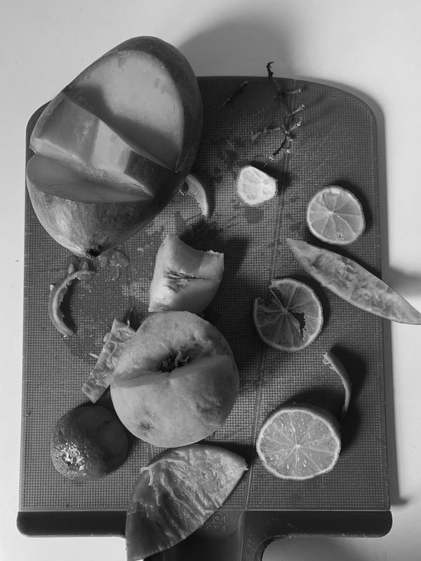
Homework - experiments Laura Letinsky


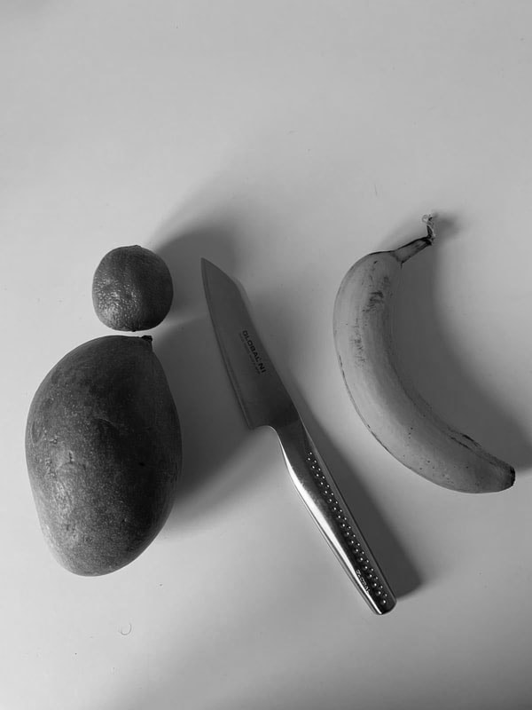
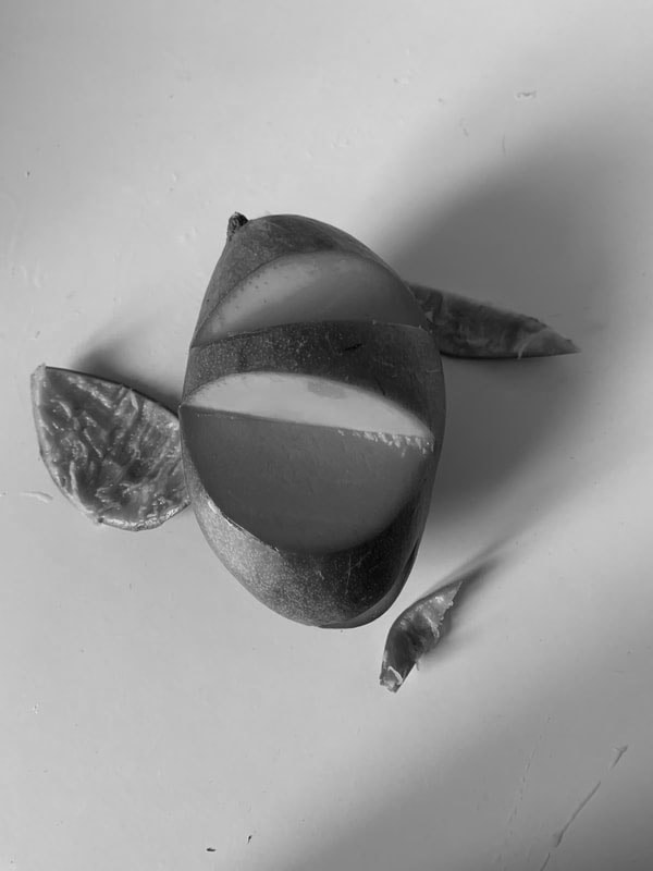
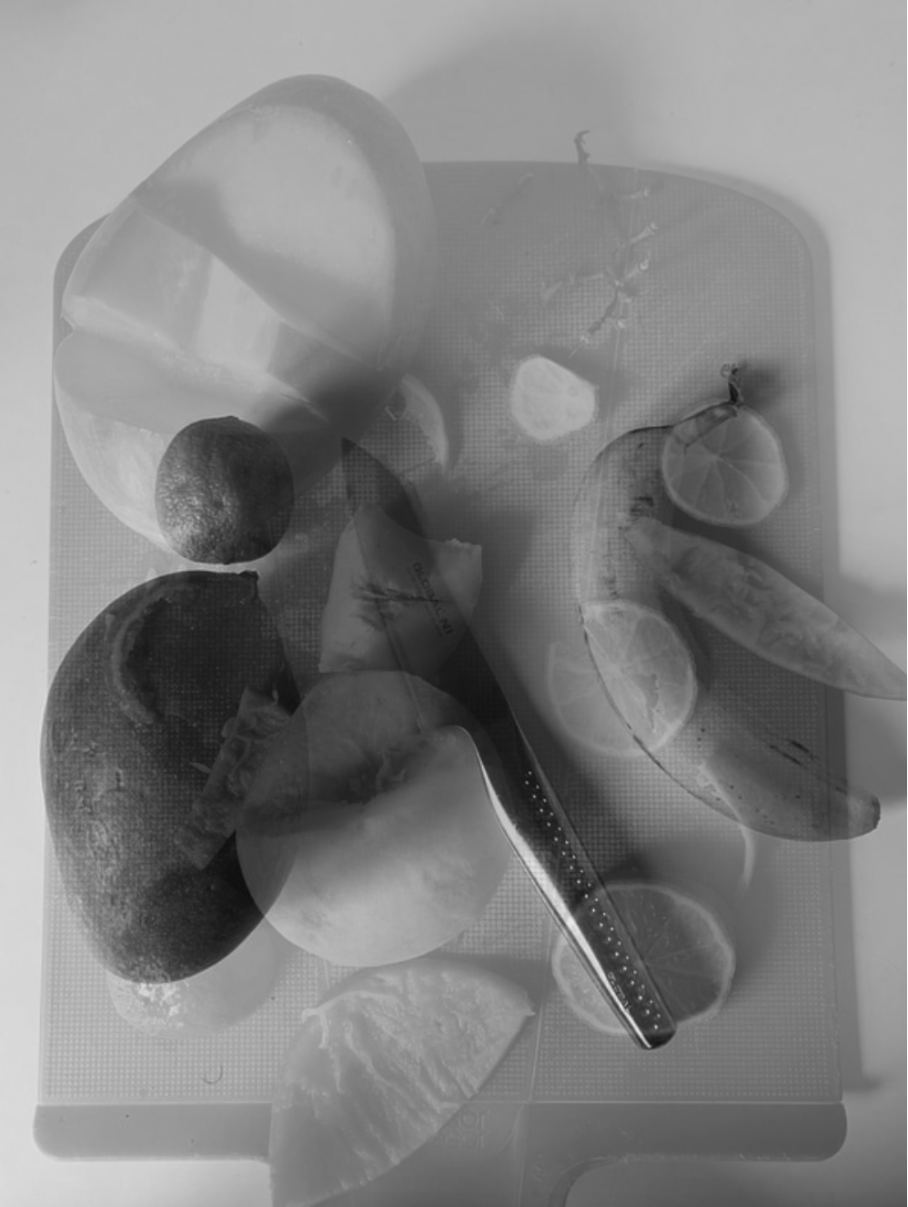
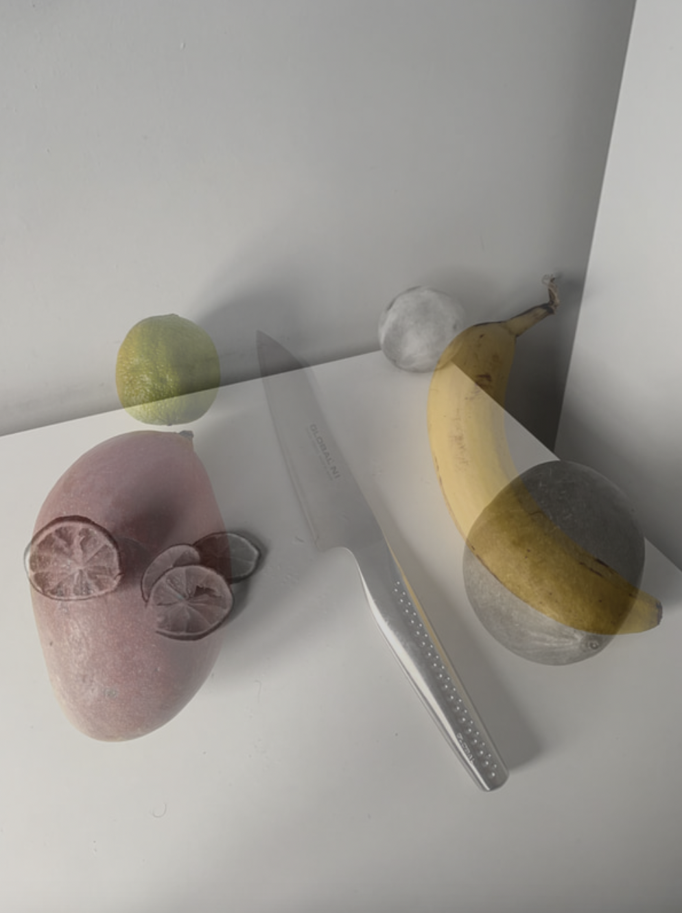
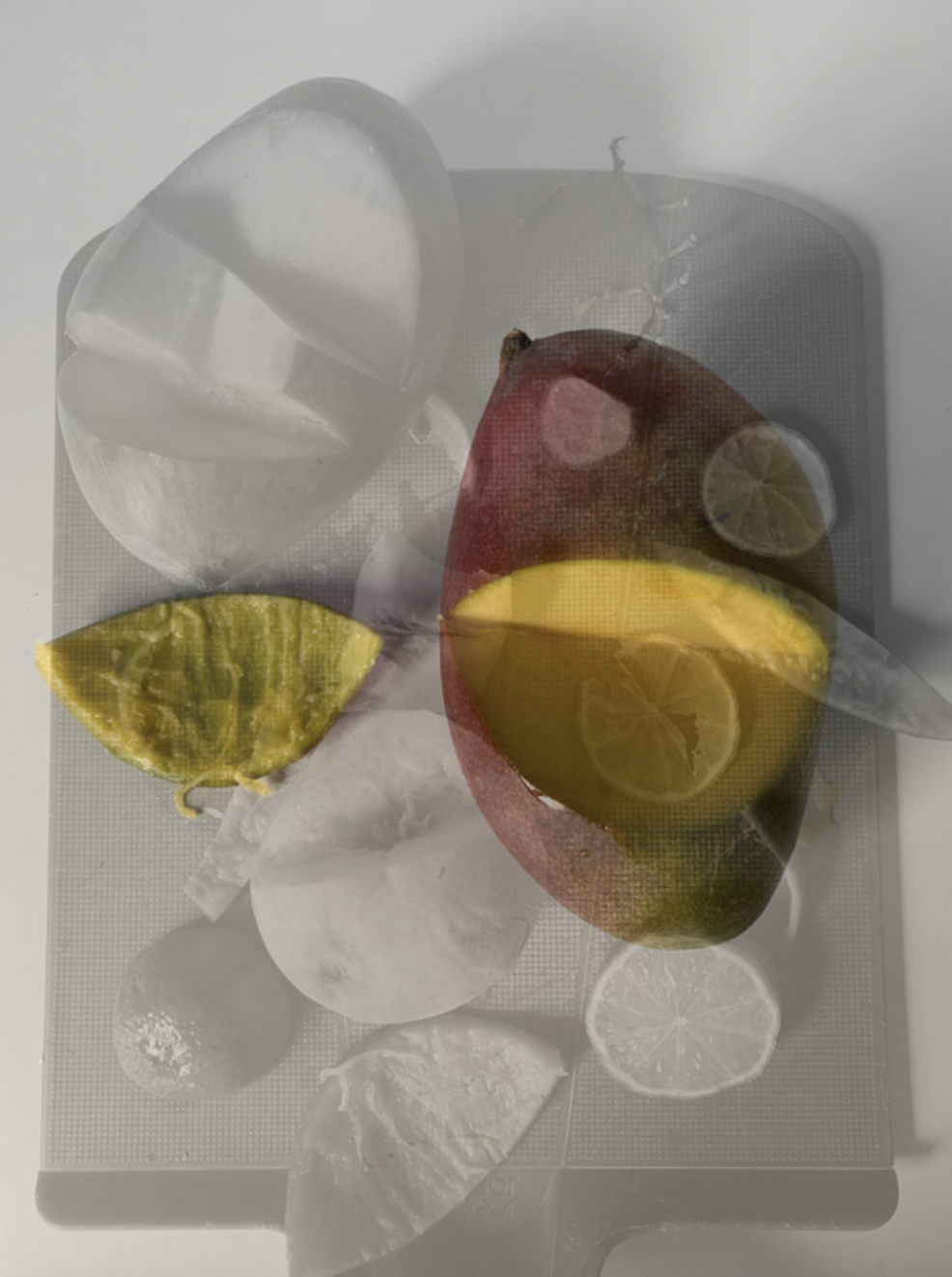
This homework is inspired by Laura Letinsky's work as at uses fruits and the idea of messiness and simplicity in the images. For example the ones with the chop board I on purpose made them more messy having components of all colors and fruits which I had, I did this because it seemed like her style of work but also because I think they would be nice to use to edit or use in a structure or book as I could use the variety of pictures to my advantage. Some of these images are also quite simple to show the contest and the amount of different work you can do with the style. I cut up some of the fruit to show the fragmentation as they have been separated from the main part of the fruit. My favorite one is the mango ones with only the mango. The reasons they are my favorite is because the background is only plain white which shows the mango off and makes it the story of the photo. Also I cut it and ate the bit that I cut of to show the differences inside the mango and just create a different type of image with more of a meaning but staying on my theme. I also incorporated the knife into it as its what created the separation and fragmentation for the fruit, this in hand creates a chaotic image which the ones with the chopping board because its like the perpetrator is being photographed creating the fragmentation.
Photoshop fragmentation experiments
|
|
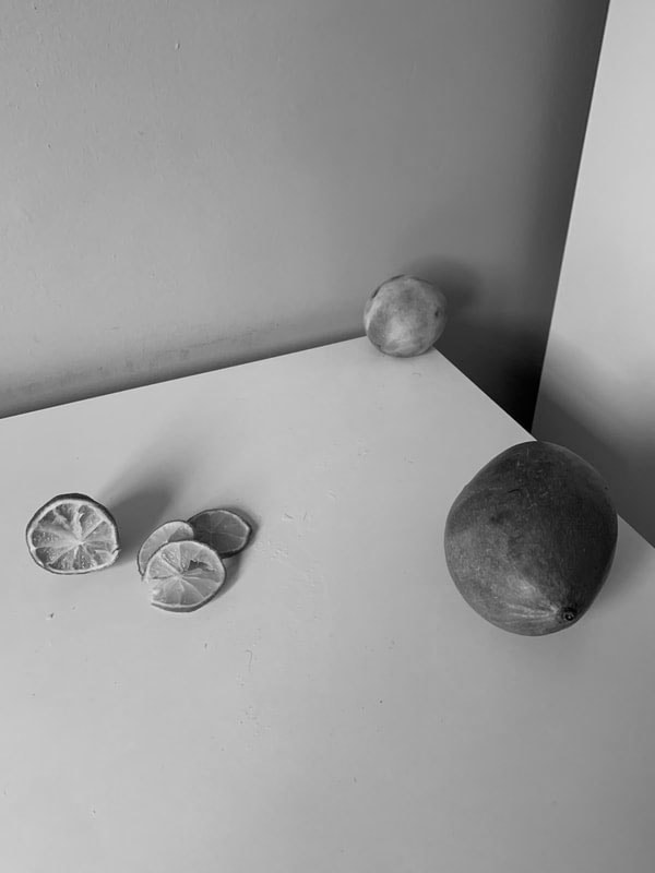
In These Images I wanted to prepare to make my structure and I wanted to experiment with black and white images and colored ones and create two different structures. The reason I wanted to do black and white is because they make the images look more clean. If you compare the colored ones and black and white it creates a calmer effect because of the cleaner look. In black and white you can also see the shadows much clearer. The details of the fruit also look better as you can really see the images more. I'm going to print these images out and do something to make a structure with some of the image cut out into different parts. This would take different takes as I would have to keep on doing until I get it right. I want to do this because I think these image will suit a structure and if they are all together then it will be more fragmentation which still follows my theme. My favorite one is the one with the knife in it. This is because I like the birds I view and the completely clean background this again makes the image look more clean.
Editing process


In this editing process for the structure below I had to go through many steps, firstly I had to make the black and white images above and I did this by editing them on photos. Secondly I had to print these image out and put them onto black card I stuck the image with spray glue to ensure there are no creases or lumps this makes the images look more clean, with the spray glue its also far less likely to peel off. Once they were stuck on I vaguely cut them out using a scalpel as in the next step I use the cutter to get a more precise cut and to ensure there is no black card on the outside. I then had to use the scalpel again to cut out any image in any particular way or to make them different shapes or sizes, I did this with a metal ruler to make sure the cuts look clean. Finally I got some wooden blocks which I had to use to do the layering and add the images on top of each other, I did this by spray gluing the blocks on the background image and adding the images on top. The fragments of all the different images stuck on each other give it the theme of fragmentation.
Fragmentation structure P1

For my fragmentation structure I wanted to experiment with layers. In this structure it was multiple layers which create more fragmentation as it looks like fragments of my photos. I thought It went very well as the black and white make the colors look more clean however if I do it again I would experiment with color. Also I had the idea to use wooden blocks too create the layers and stick them on as well as the cut outs of my images which went well. I also took a lot of time to make this and I made sure to do things precisely which ended up working in my favor as it looks much better than any other structure I've done before. The shadows also pop out in the structure as they are bold with the use of black and white. If I was top do it again I would firstly do it different colors to make the structure vary and have different types of layers which would add to the idea of fragmentation, secondly I would vary the paper size as again I think it would be easier to layer but it would also look better. The use of the fruits make the fragmentation theme stronger as the use of multiple different types of images make the fruits look like a bundle and together.
Editing procces


This is again a structure like the last one however this one uses colors and a couple different techniques. Firstly I had to create the colored images which I did on the printer and by accessing it you can change the way it prints out color so for example I printed out a plethora of colored images to make sure my structure has lots of different colors. I then had to again use black card and spray glue to make a solid image which I could use to make the structure. Then I used the cutter to create a more clean image with no black card on the outside this makes the image more appealing. Then I again used blocks however these ones were slightly smaller and less heavy because it felt although the last ones were to heavy. Once I had cut out the images in different shapes with the scalpel I glued it all together with spray glue as it sticks much stronger than regular glue. This again follows fragmentation as the images layered create one image with multiple images, this is intensified by the different colors popping out.
Fragmentation structure P2

This again links to fragmentation as the pictures are from different images however they are all put into one structure making it seem as all from one image but there's multiple. They are also all different colors giving each image more identity in the structure as a whole and just makes it look better as the colors pop out more I did this by using all different images which I made on the printer using color filters. I did this because I wanted to use more colors in my work to develop my idea of the structure into something more I developed it more as I used different shapes to show and hide parts of the image behind. I like how the structure came out as the colors contrast each other but also match. I think that i have also improved this by making it look more like one image, for example the other one looked more layered which has its benefits and negatives. If I was to do this again I would use more images originally to create a bigger structure with more layers and colors. The tone this image creates is a frantic manor due to the bright and pop out colors like pink and red, this then creates a sense of excitement and joy in a way. Furthermore if i do this again I may even add the bright colors and the black and white images to create an even more contrasting structure.
Editing process


In this editing process I had to use photoshop and I got the images off of my photos and dragged it on to the app, then on some of the images I changed the color to black and white using the properties function, I also made sure the black and white was a lighter one so more grey. I did this because I wanted the color to pop out more when I put the layering image above. I did the layering by adding the image on top and changing the opacity top around 70 percentage this seemed to be around the perfect percentage as it still clearly showed the background with the layering there. If I wanted the layering image to be black and white instead of the background image I would do the same as any other put after the image has been added and I would have to make sure to click on the image so I don’t do it to the wrong one.
Fragmentation photoshop developed
|
|
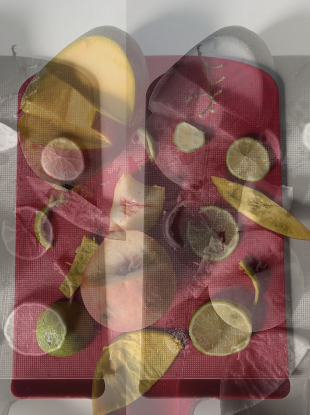
These images are developed since my last photoshop experiment as I want to build on my fragmentation structure so I thought images with other other images overlaying wouldn’t just make it closer linked to fragmentation but also make the structure better and more interesting as I want to develop it even further. With some of them I wanted a background with colors which have overlapping black and white images, this is because they look more abstract which is what I wanted to achieve as I progress through the course. I liked to use the image with the most fruits and objects as the background, this is because I wanted to create more of a busy image meaning that I wanted there to lots going on but yet still simple. I think this will add lots of details to a new structure and more depth into it. The reason I want more depth and structure is because I want to improve my structure and I think this is another way to do so. This idea of layering looks better with the fruit as it all comes together because although they are not the same fruit they all look together even if it's in a messy way. This reiterates a feeling of home as its something familiar but yet linking back the idea of a busy image they still hold those morals too, so in this case it creates duality with two emotions which can be further seen through the color of two of the images popping out making more of a contrast between the black and white and the colors - which in this case are bright colors due to the fruits which further reinforces this idea.
Editing process


For this editing process I had to go through similar processes than last time. For example I had to again print out the images I created on photoshop so I could glue them on black card and I used spray glue to make sure there was no creases or bumps in the paper. Then using a scalpel I cut out the images from the card and using the cutter to cut out the images even more precisely. Then this time I got even smaller blocks as they still seemed to heavy in the last one, and this time I also used a glue gun with even stronger glue and I did this so the blocks would stick on even better with the background and the image. This made my structure even more stable.
Fragmentation structure P3

In this final structure I used my developed images which had pre layering but I added more with the use of blocks underneath them to add depth into the structure. The multi layering creates a distorted effect with the structure and the pop out of color makes the black and white not seem boring. With this structure there's much more little details as some fruits are not as visible which makes the structure more interesting as you have to search to find all the details. All the layers really show the fragmentation as all the images and fragments of fruit all come together making a big piece of fragments. The amount that's going on makes this my favorite one as it still has color that's popping out but its just elevated showing the development from structure to structure as I learn more from techniques in making them to ideas about how to change them in better ways. I also like the tone the structure gives off as if some of it is dull with the grey sort of theme as there is even some grey fruits inside the colored ones but yet the colored fruits bring it to life. One part of image which I like a lot is the part where the mango has a section missing and its eaten which I think shows a fragment of the mango is gone and gone forever.
Final piece making day plan:
Materials:
- Glue gun \ Glue spray can
- Own images
- Card
- Scalpel
- Wooden blocks
Plan:
My final aim is to make a structure. Firstly I will have my pre-printed images and use spray glue to stick it onto the card, then using a scalpel I will cut them out afterwards I will plan out where i want to place the images and in what sort of formation. Once i have that figured out I will get my wooden blocks and using the Glue gun I'll stick the wooden blocks and card together creating my structure.
Images I'm using:


